Lenticular LEGO: A Double Mosaic of the Vegas Knights
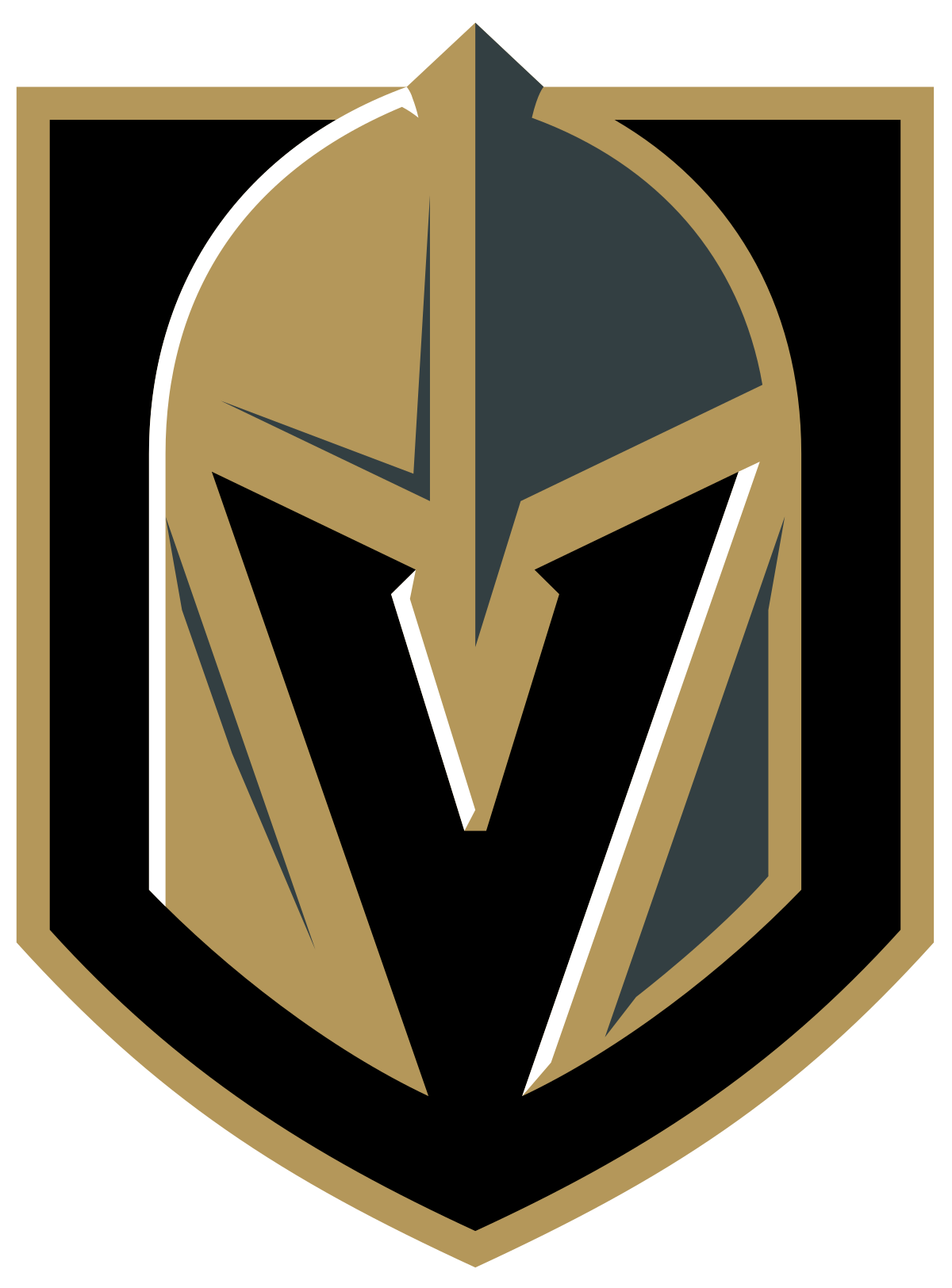
/The Stanley Cup Finals last month were great. Since I’m in Las Vegas, I follow my local hockey teams, the Vegas Golden Knights (who didn’t do very well this year) and Henderson Silver Knights (an affiliate of the Golden Knights with the American Hockey League [AHL]). Also being an Adult Fan of LEGO (AFOL), I wanted to make a mosaic of their logos as they are really cool to me.
Images via Vegas Golden Knights and Henderson Silver Knights.
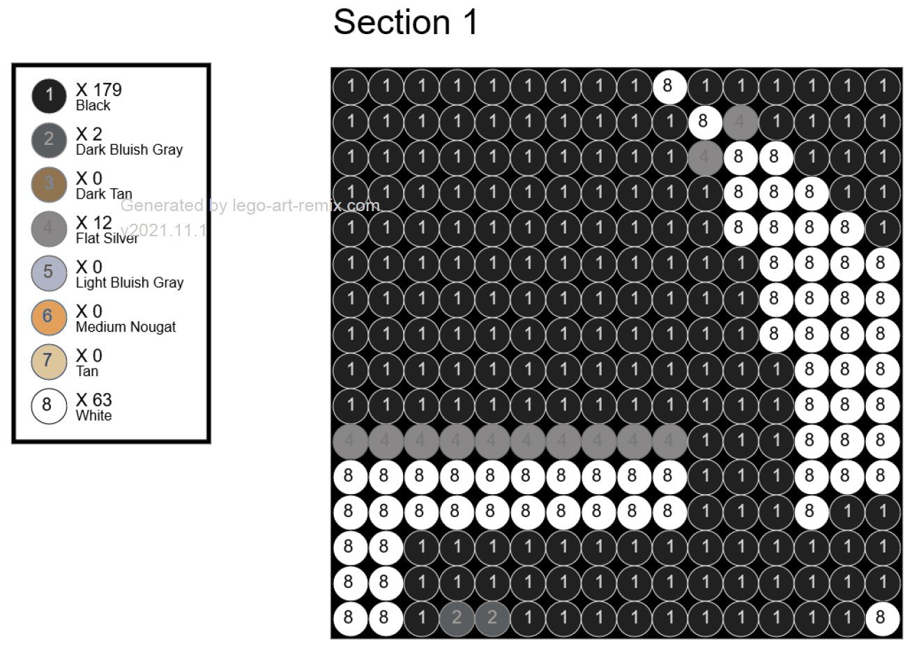
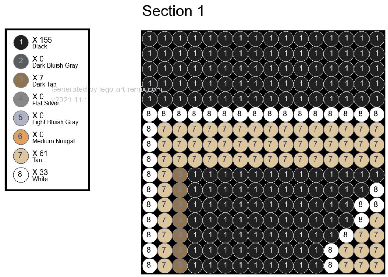
So the first task was to figure out the size because that would then set the scale and number of pieces I would end up needing. I tested out a few online mosaic makers and quickly realized 48 studs x 96 studs for each image would be about perfect. (The site I ended up using was Lego-Art-Remix.com.) Why this size you ask? Well, because at that size, it fit the rectangular size of the images and was a convenient multiple of a standard-sized baseplate. Besides, I didn’t have enough bricks to make it bigger!
Lenticular Leanings
I originally thought I could make two separate mosaics and hand both “posters” in my brick space. But then I remembered some 3D cards that change pictures when you shift them slightly, and I had an idea. Maybe I could do a LEGO “lenticular” and put the pictures together!
Example of a lenticular poster
What are lenticular designs? Those are the designs when if you look at the picture head-on, it looks like a weird unrecognizable combination of two images. But when you look at it from an angle from either direction on the side, it magically shifts—on the left side it’s one image and the right side is the other image.
Slope 30 1 x 1 x 2/3 (Cheese Slope)
But most AFOLs don’t have fancy printing machines that can do this, so how do we do this in bricks? Well, we use the handy and humble cheese slope (yummm cheese).
Putting two cheese slopes back to back essentially gives two surfaces only viewable at specific angles to create the two images superimposed upon each other. They can’t stack on top of each other though, so that meant that the size I was planning for needed to double, merging them together into a 96-stud x 96-stud picture. (The vertical size doesn’t change, just the horizontal size.)
Seeing Double
Taking the suggested instructions from the site, I needed to merge them as I built. I decided that the Silver Knights were going to be on the left and the Golden Knights were going to be on the right. So merging the two sections as I built, I went down each vertical line and alternated back and forth.
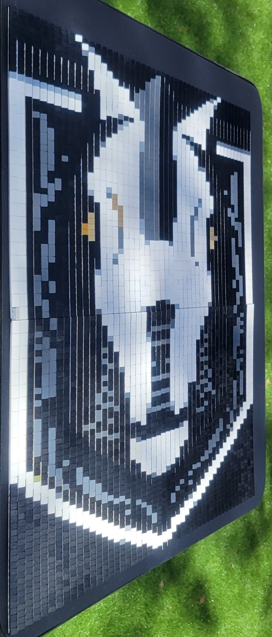
When I completed combining the 16x16 section from the instructions for both, the result was what looked like some kind of weird, rough cheese grater that was 16x32. Columns for the Silver Knights are the odd columns and the Golden Knights are even columns.
Golden Knights in odd Number Columns and Silver Knights in Even Number Columns
Now I just needed to do that 16 more times… I’ll spare you a detailed play-by-play narrative of making the rest of the panels and skip right to the end.
Knights of the Square Table
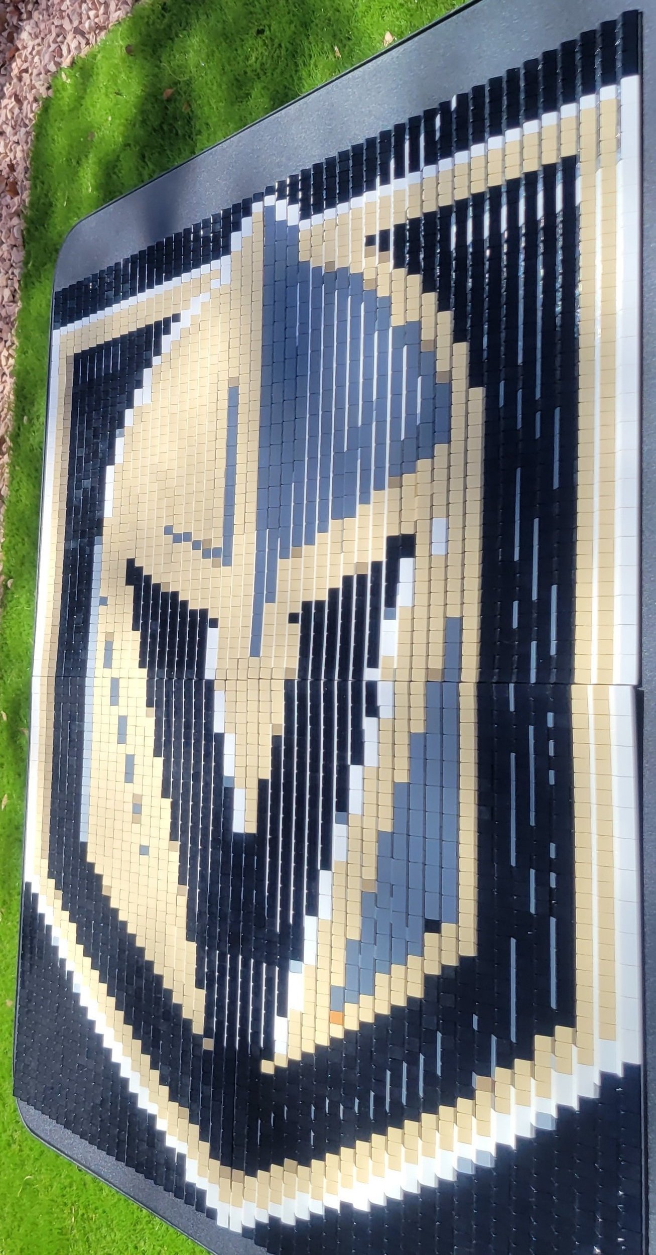
When finished, all of the panels together formed a 96x96 mosaic of combined the Golden Knights and Silver Knights logos together as one. From the front it looks like a weird, stretched and barely recognizable image—that kind of looks like a Transformers logo.
But viewing it from an angle on either side is where the images really pop! Each column of cheese slopes blocks the view of the row next to it, essentially making two mosaics in one.
Now I need to get metallic gold and silver cheese wedges to really make the logos pop!
What two images would you use in a lenticular mosaic? Let us know in the comments below!
Do you want to help BrickNerd continue publishing articles like this one? Become a top patron like Charlie Stephens, Marc & Liz Puleo, Paige Mueller, Rob Klingberg from Brickstuff, John & Joshua Hanlon from Beyond the Brick, Megan Lum, and Andy Price to show your support, get early access, exclusive swag and more.

