Saddle Up Apone...

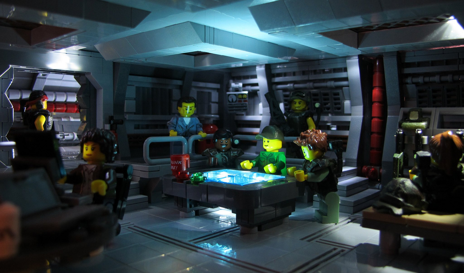
I just watched this movie the other night. Still holds up beautifully 27 years later. This MOC depicts the scene where they discover the location of the colonists.  This brilliantly detailed and lit interior comes from Missing Brick, who has a whole series excellent scenes from Aliens. Custom minifigs by Matthias.

Thanks for the head's up Pete 

Ace Granger Space Ranger

There's so much about this I love I'm having trouble keeping my composure. Actually, who's going to care, the puppies? (does little happy dance, no one knows). This is an excellent little bit of Photoshop and photography. It hits the mark for total retro look, right down to the Brickarms ray gun. There's some great subtle humor in the text too. I want to watch this series right now!

Ace Granger Space Ranger

A Matter Of Light And Depth

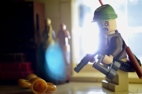
Time for another photography post. This picture grabbed my attention while scrolling through Flickr. Not because of the elaborate or clever build, but because of the photography. I can't emphasize enough the importance of taking good pictures of your work. I love the depth of field and light blooming in this shot, as well as the lens flare. I know it may all be happy accident, but when all the elements drop into place like this, the results are awesome.

Afterwards

Polishing His X-Wing

This photo by DigiNik13 makes excellent use of depth of field. DOF typically haunts MOC photography by diminishing scale or losing detail. But when used correctly, like this, it makes the shot. It's a simple trick that's hard to master. See how you have no problem identifying the ship he's standing next to, yet Luke is set off the background by focus. The lighting is also great, with just enough reflections and highlights to sculpt and model the contours. Nice shot.

Polishing his X-Wing

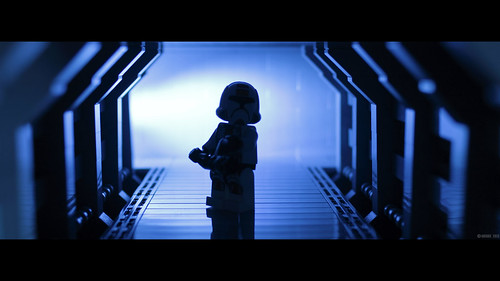
Moody Corridor

This shot is a great example of how a compelling MOC shot doesn't have to be complicated. This is a very simple setup, with nothing more than a simplistic corridor and a minifig, yet you are drawn in. The lighting isn't complicated either, just a single source. But the color, silhouetted figure, rake lit edges of the hall, agreeable depth of field and blooming background all work together for a nice shot. And it's just a test, I can't wait to see the real shots.

Corridor Experiment

Let There Be Light (painting)

I know what you're saying, "Hey, that's not a MOC, that's the LEGO Technic Supercar!". You are correct, but this post is not about the build, it's about the shot. Flickr user Jon Bradbury used a very cool method of multiple light passes to capture this shot. The model and camera are locked off and multiple exposures are made with lighting from different angles. And get this, it's lit with an iPad. The different shots are then combined into this final stunning image.  It's essentially the same technique used in visual effects to layer multiple passes in CG. It goes to show what can be accomplished with a little prep and patience. Excellent work Jon.