Self Scrutiny: Learning From Past MOC Mistakes
/My first piece of advice, when asked by a new MOC builder, has long been to keep your old MOCs around until you can’t stand the sight of them—and then keep them around longer. The reason behind this seemingly masochistic practice is if a MOC goes in the scrap bin the moment the sight of it ceases to stimulate dopamine production, I would miss the opportunity to understand what specific shortcomings got under my skin. Knowing that I disliked an old MOC versus why I disliked it makes all the difference in not making the same mistakes again.
My self-scrutiny is not all negative. As my list of nitpicks about a MOC grows, I will take note of any detail that manages to survive the test of time, as these are opportunities for further exploration. But as the saying goes, we learn more from failure than success, so I focus most of my attention on the things I like the least.
What I have never done, however, while handing out this advice, is give specific examples. I intend to remedy that here by giving a brutally honest critique of some of my own builds. I am limiting the critiquing to my own creations, as I don’t wish to nitpick other builders whom I, in actuality, admire a great deal. In real life, I do study other builders’ MOCs. As AFOLs, we have much to learn from each other. I learn what I need to improve from my own creations and ways to improve them by studying others’.
Greebling Greatness
My journey as an AFOL began one afternoon when I built a spaceship because I was bored. It was uninteresting by AFOL standards, but at the time, it impressed me enough to look for a place to share it. I found a place—and the AFOL community along with it. I was blown away by what I saw–LEGO being used in ways that I’d never even dreamed of—in the likes of Dan Jassim’s Dragonstar seen below. I was immediately sucked in.
I toiled with some small builds at first and gained a cursory understanding of basic concepts such as greebling, color blocking, and SNOT. Given my inspiration, though, I inevitably attempted a SHIP long before I knew what I was doing. About three months later, I’d created a behemoth which I titled the Minotaur.
To get the elephant in the room out of the way, the first flaw that jumps out at me is the photography, here and in other photos. This one is underexposed and the lighting is bad, which makes it difficult to even see the numerous other areas for improvement. But photography is beyond the scope of this article, I will limit my commentary to the builds themselves.
Prior to my venture into SHIP building, one of the early critiques I received was that I didn’t have any greebling (the little bits that add texture and interest to the sides of an otherwise blank model). I took that to heart, which did lead to an improvement in my building, but I went overboard with it. Much of this build is an amorphous blob of greebles. They engulf it like ants devouring a spaceship hidden somewhere beneath.
I am a huge fan of greebles, and I don’t see anything wrong with having a lot of them. The problem here is that there are no lines or color blocks standing out to give it form. The few ungreebled sections of hull paneling are the same color as the greebles, and so they just get lost in the mess. Simply using another color for the hull panels might have made a world of difference.
One trick I like to use to check for this sort of issue is the squint test. I stand back a little and squint at a build so that just the lines and color blocks stand out. As important as details are, it is possible to get so bogged down in them that weak points in the basic shapes go unnoticed. The squint test makes those weak points obvious. In this case, the squint fails spectacularly because there are no basic shapes—there’s just a basic shape, singular. Squinting at these photos, all I see is a silhouette.
Being new to greebling, while I used a lot of it, I certainly had not mastered the art. I don’t believe complete mastery of greebling is even possible because new elements are added as others fall out of production. As the selection of parts available evolves, greebling techniques change, making a perpetual learning curve. There are some basics, though, and I had not yet learned those at this stage.
I believe the best greebles flow together so that the little pieces combine to make larger but distinct pieces of machinery, which in turn become parts of even larger machines and so on. And they should look like something that belongs instead of filler in places where inspiration was lacking. The greebling here looks tacked on, as in the radar dishes on the roof, or looks like a mass of unconnected tiny parts, as on the starboard side of the nose. There is simply nothing tying anything together.
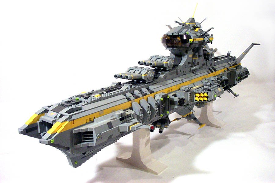
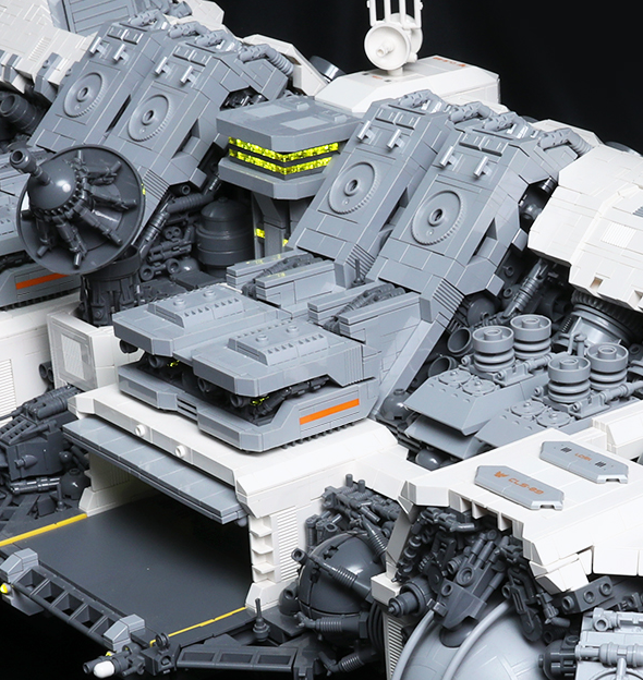
In contrast, consider this section of the Ugly Duckling, a much more recent creation. The greebles are made of a couple of distinct color blocks, both different from the hull panels. They are recessed into the hull so that the hull appears to contain the greebles instead of the other way around. And the parts are aligned in ways that tie them together. I would not call any of these aspects rules, but they are useful techniques for making greebles look coherent and not tacked on. There are many other ways to solve the same problem.
While the Ugly Duckling was an improvement over the Minotaur for sure, looking at it now, I could have done more. By a trick of the light, there are a few parts buried in there that look like flat silver but are really light bluish gray. I wish they actually were the color they appear to be. The world is full of color—machines included. Too much variation can make greebles look cluttered, but I wasn’t close to pushing the limits here. A bit of black or pearl dark gray tastefully mixed in would have added some more realism. I was too timid with my color choices for much of my early AFOL days. This was the first MOC where I began a deliberate effort to be more daring on that front.
Framing the Problem
Another of my beginner mistakes on the Minotaur was in the building process itself. Today, I live by the rule that my original idea is not sacred. If a model is going in a different direction than planned, then taking it where it naturally wants to go will probably lead to a better result than forcing it into the original vision. The way I went about this build, I didn’t leave much room for changing direction without major surgery.
I started by building the bottom half of a form-fitting frame and then began stacking bricks on top of it. Starting with the frame isn’t a problem. It’s not how I personally build now, but many builders have great success that way. The issue is that I built from bottom to top in a way that tightly integrated the frame before I was even sure if I had the basic shapes right. I’ve found that it’s much easier to adjust plans by progressing along the longest dimension—in this case, lengthwise—because if something isn’t working, there’s far less brick to rip off.
A final lesson learned from this build came from Dan Rubin, who advised me to make a pass over all the details toward the end of the build. The guns were a specific detail he singled out, which I had, in fact, somewhat mindlessly constructed in the exact same way I’d built guns on spaceships since I was a kid. I did go back and update them, which was an improvement, but the whole model could have benefited from that final pass of scrutiny.
When I build today, the re-evaluation of everything large and small is a continuous process. Every little detail plays a role in the overall composition, and as that evolves, the details that have already been built may need to evolve with it.
True to my mantra, the Minotaur collected space dust for over a year before I attempted another SHIP. For part of that time, I was living in a single room during my first year of graduate school. I did not have room for my LEGO, so the Minotaur perhaps survived longer than it otherwise would have. But when I did eventually move into a larger place, my brick followed soon after—and it was inevitable that I began thinking of building a better SHIP.
Sketch-Building
This time around, I learned the lesson of not committing myself to architectural features that I had not taken the time to think through. I hardly had a plan at all with this SHIP beyond a flat body with a big knife-like keel (earning it the name, the Paladin, early on). The plan, beyond that, was a blank slate in my mind. It went ok as I progressed through the portion of the build that I had a vision for. My main critique, thus far, is that it is far too monochromatic–those bits of red are just band-aids slapped onto a bland color scheme. They fix nothing.
From that point on, I repeated the same motif backwards without really considering where the build was going. That shortfall in planning came back to bite me, as the longer the ship got, the smaller the keel got proportionally. By the time it reached a substantial length, the blade-like aesthetic of the keel was completely gone.
I don’t think the lack of planning in advance was necessarily where I went wrong. I’ve done several large builds with nothing but a hazy idea of what I was creating. I am working on one of those now. I’ve found that the trick to building big without a clear vision is to plan ahead just far enough. I find that easier than planning everything in advance because what I have built so far can give me ideas about what to do next.
I do that by sketch-building sections before I build them for real, capturing not much more than color blocks and basic shapes. I usually sketch-build with brick because it’s always piled in front of me, but since the sketch will not be part of the finished build, I will use anything convenient within reach. In the past, that has included folded bits of paper, blocks of wood, tools, books, my phone, and my arms.
What specifically was wrong with the keel wasn’t entirely clear to me at the time. Looking at the photos now, the bottom edge of the keel is straight and parallel to the top of the hull. Blades come in all shapes and sizes, but a rectangle is not generally the first thing that comes to mind when we picture one. This looks like a broken floorboard. I ultimately decided to rip the keel off entirely—perhaps the first time I embraced my rule, my original idea is not sacred—but If I’d been determined to keep it, giving the bottom edge of the keel a more interesting shape to create points or curves would have re-captured the blade look.
Straight keel or not, this ship suffers from a bigger problem. There is little tying the roof, main deck, and keel together visually. Blocking off the ends, it looks like a row of futuristic houses rather than a spaceship. The issue I see is that boundaries between those layers are too straight while abruptly changing style. Some structures spanning all three levels, or repeated architectural elements on the top and bottom, could have tied it together nicely.
Again turning to a newer build, the gray structures extending from the roofs of the hangar bays serve that exact purpose; they break up the dark strip of greebles that would otherwise have bisected the ship and tie the hangar bays to the other side of the hull.
I do consider the end result an improvement over the Minotaur. I learned the lesson of leaving enough clean hull panels to give it form, and the red stripe on top stands out among the greebles. From some viewing angles, I actually prefer it over the subsequent SHIP I built. The biggest flaw I see from my favorite angle is, again, color. Even with that red stripe, it’s just too bland. Some noticeable amount of at least one other color would have gone a long way.
Showing the Best Side
Architecturally, the major flaw of this ship was that it only really looked good from above. That’s not to say that there is anything wrong with having one main viewing angle—I’ve seen many great MOCs built that way. The issue here is that it was not a deliberate creative decision; I built it to look good from every angle and succeeded with only one of them. The end result looks like I had a plan for the top view and didn’t know what I wanted the rest of it to be, so I just propped the roof up on some greebles. That is, in part, a relic of the keel issue.
It became apparent early on that I was trying to build two different ships at the same time—one wide and flat while working on the top, and the other tall and thin while working on the bottom. When I became aware of that tug of war, I saw it as a curiosity rather than a problem that I should resolve. Had I tried sketch-building to form a more coherent plan for the basic shape, the build would likely have come out cleaner. Waiting so long to correct the error left me with an agglomeration of two different spaceships, with most of the bottom one sloppily hacked off and painted over.
The clash between the clean top and messy bottom side also highlights the lack of a middle ground. There are many featureless panels on the top and greebles on the bottom, but there aren’t many surfaces with just subtle texture. The occasional hollow stud, half-plate recessed panel, ridge of 1x2 tiles nudged out a hair, grill brick, or the extremely subtle offset created by door-rail plates on jumper plates makes those otherwise plain areas look interesting without becoming such a sensory overload that we’re back in Minotaur territory.
Engineering a MOC
By the time I finished the Paladin, pushing the limits of LEGO engineering had caught my interest. There is no technique in it that I would consider to be any kind of LEGO engineering marvel, but it was more technically advanced than anything I’d ever designed myself before. I concluded, when I yet again had SHIP building on my mind, that I should lean hard on engineering. I am not naturally artistic. Most artistic crafts I’ve delved into over the course of my life have been abandoned in frustration. I have always had the interest, if not the skill, so the possibility of engineering my way around artistic deficiencies with LEGO was immediately intriguing.
Eleven months later, I had a new, larger concoction of mostly gray brick, which I dubbed the Manticore. My gripe with this build is that I became so preoccupied with the engineering that the artistic aspects became something of an afterthought (including, again, the band-aid color highlights in place of an interesting color scheme). While the Manticore used more complex techniques, artistically, I think the Paladin was superior.
There are some interesting shapes on this ship, but when I look at it, I don’t get the feeling that they have a reason for existing. The giant flying laser is, while not novel, a fun concept. But when I picture a giant laser type of ship, this is not the image that pops up. I would envision masses of greebles (arranged thoughtfully) from one end to the other, with paltry crew accommodations wedged in where some engineer begrudgingly found room. This ship has that entirely backwards—it is one of the least greebly sci-fi builds I’ve ever done, and the giant laser section is tacked on to the front, with the space behind it occupied by fighter bays and their associated maintenance shop.
Both in terms of architecture and function, this ship has small bits of too many things—a giant superweapon, but not giant enough to pass off the ship as a huge flying weapon; fighter bays, but not enough to pass as a carrier; smaller gun turrets, but only on top leaving the ship vulnerable to half of the entire observable universe at any given time; and a bridge that, while neat, looks more like the observation deck from a space yacht.
I could imagine all the bells and whistles on this ship, and more, coexisting on one spacecraft, but a much, much larger one. This ship tries to cram in so much that there is no room left to think about the overall composition, or what even looks plausible.
As with the Paladin, I can trace some of the shortcomings to the build process itself. I started off with the front cannon and bridge, largely because they were round, and at the time, round objects felt like the pinnacle of LEGO engineering to me. Click hinges appeared sometime between the last spaceship I built as a child and the first I built as an adult, so the ease with which they could make curved shapes stole the spotlight at the beginning of my AFOL years.
Click hinges have since lost their novelty, and while there are some other tricks, the real issue is that none of those tricks are used in a way that adds something to the build. I made the Minotaur mistake again here—I learned a new trick and went overboard with it.
Superficial Details
While I don’t think my effort to engineer myself to the next level actually busted through any plateaus, again true to my own advice, the Manticore sat undisturbed for a couple of years while I contemplated what bothered me about it. Having refined my personal style and creative process a bit more since then, I understand where I went wrong. Spacecraft, and sci-fi creations in general, are interesting beasts in that they can be any shape the builder wants as they depict things that don’t yet exist. I’ve found, though, that it’s the subtle details on the surface, not the shapes, that can make or break a MOC. Those tiny details are what make crazy concoctions of funky geometry look convincing.
Chris Giddens’ Phortion Mille 2 is a great example of the power of superficial details. It has a boxy shape, and yet there is not a boring brick to be found on it due to the wonderful detailing on every surface. Seeing that not long after I finished the Manticore was an eye-opening moment.
I use far more crazy angles now than I did on the Manticore. But these are not where I focus the engineering effort. Those angles are rarely more than clips and hinges. The only really technical element is making the right tiny offsets in the right directions to make out-of-system angles align well. I spend far more time engineering features that wouldn’t even be visible in a thumbnail.
I’ve picked apart my earliest MOCs here because they were from that initial period of rapid improvement that often happens when learning a new skill—when I made more mistakes and learned faster from them. The process of mentally eviscerating my own creations continues to this day. I have as many on display as I can fit in my LEGO room, and every time I walk in, I gain a little bit more insight into why certain things bother me.
Some of my MOCs I am still quite fond of; some of them bore me. But regardless, each one has lessons to teach me that will one day be applied to my future LEGO creations.
Have you learned any lessons from previous MOCs? Let us know in the comments below.
Do you want to help BrickNerd continue publishing articles like this one? Become a top patron like Charlie Stephens, Marc & Liz Puleo, Paige Mueller, Rob Klingberg from Brickstuff, John & Joshua Hanlon from Beyond the Brick, Megan Lum, Andy Price, Lukas Kurth from StoneWars, Wayne Tyler, Monica Innis, Dan Church, and Roxanne Baxter to show your support, get early access, exclusive swag and more.

