Playing in Space: Travelling the Cosmos Through Forced Perspective
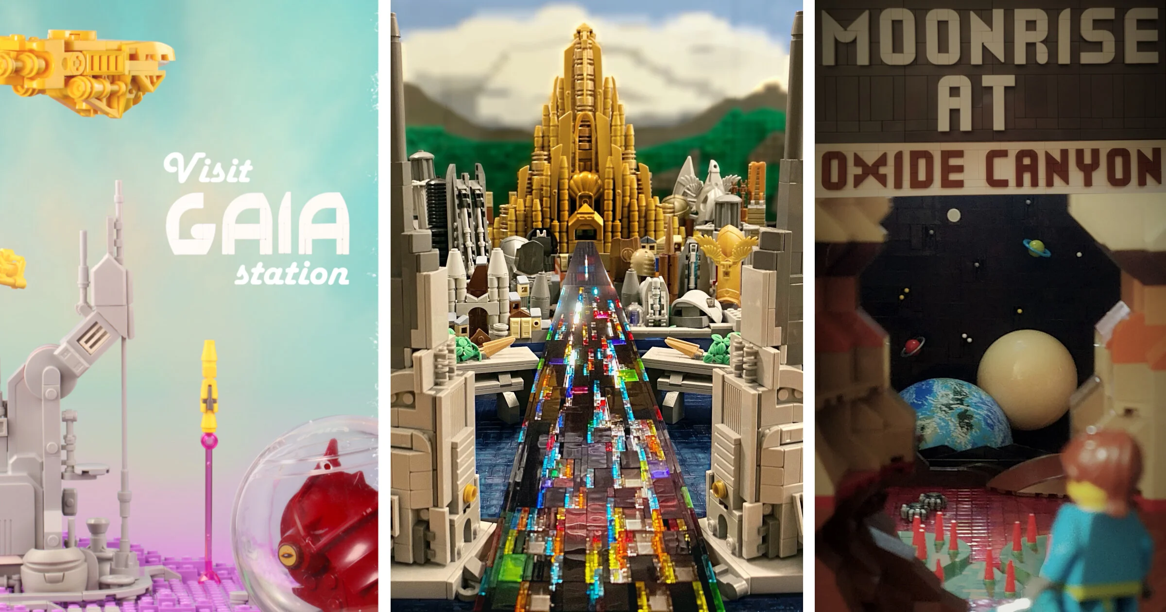
/Ever wondered why anyone would want to travel to outer space? Well, if these LEGO builders’ brick-built travel posters are anything like reality, outer space is an awfully cool place!
If you’re curious why a bunch of builders suddenly built travel posters for fictional planets, Space Jam is the reason. Space Jam is an annual December-January space-themed LEGO contest. This year, there was a category I found very interesting, even before I saw the entries—you guessed it: Travel Posters. And after I saw the entries, I was mind blown!
I wasn’t the only BrickNerd contributor impressed by this year’s Space Jam entries: Ted Andes wrote about an amazing entry in the team category! Speaking of Ted, he was actually the one who came up with the Travel Poster category, so I asked him about his inspiration:
“For the travel posters, I always like seeing the retro ones that NASA promoted some time ago. During the build up to Decisive Action 4, Matt Rowntree teased us all with mock travel posters for the various map territories but they never ended up actually becoming a build category. It stuck with me that it was something I really wanted to build. Early on we thought that we might have an over-arching musical theme for Space Jam of a “Rock Concert,”so an idea for a Concert Tour Poster came up first. When we decided not to force all the categories into a musical theme, then that evolved into a travel poster.”
So without further ado, let’s jump right into the amazing worlds that the Space Jam category treated us to!
Gaia Station
First stop: Gaia Station. Builder Loïc (lokiloki29 on Flickr and loki_loki_29 on Instagram) pitches it to us this way:
“The Gaia station, located on the Eridani planet, is the perfect resort for a weekend getaway.
Rent a protective suit and go for a hike on the Purpurite mountains. Hidden beneath the surface, discover the giant Krishna caves and admire its diamond walls. Looking for thrills? Get on board our rocket for an orbital guided tour around the planet. At the end of the day, take the aerotrain and relax at our luxury spa. The Aether restaurant, located at the 214th floor, offers exquisite dining with fresh meals prepared by the most renowned chefs of the galaxy. All rooms feature a stunning view of the mountains. Due to the unique location of the resort, a continuous magenta sunset can be witnessed at any time.
Our partner Daffodil Spacelines offers frequent flights departing from several astroports in the system.”
The simplicity and inviting color scheme of this poster really caught my attention, and I asked Loïc a few questions about it.
Geneva Durand: How long did it take you to build your poster?
Loïc: Overall, the design of the poster took about a week. The building itself took half the time and the photography and editing the other half.
GD: What inspired you to use lavender for your landscape? It goes beautifully with the yellow spaceships!
L: I was inspired by vintage travel posters that often use pastel colours. I had previously worked on an unpublished MOC consisting of a light bluish grey mech on a lavender space ground. I found that the two colours were a good match. I reused the lavender plates to build the landscape which gives that pastel look, and the LBG [light bluish grey] for the technological and futuristic aspect of the infrastructures. The tower was inspired by concept art by Sparth (including this one) where I really liked their angular appearances. I used the Mindstorm motor as a starting point for the buildings.
Then the retro travel posters sometimes show a figure in the foreground looking at the landscape. I built the alien head inside a helmet (which is originally a LEGO Christmas ornament). I intended to build the whole upper body, but I was not happy with it, especially the connection between the head and the shoulders. So I cheated and only showed the head. :)
GD: How long did it take to figure out the layout for photography—you have a pretty elaborate support system with a good deal of depth, that must have taken some experimenting!
L: During building, I did some photography tests with my smartphone to find the best positioning of these elements. I then built the “Gaia” text and I thought that the scene looked a bit empty at the top, it needed some spaceships. To choose their colour, I just went for yellow because it simply looked the best along with lavender and the teal from the sky. I realized those three colours were complementary in triadic composition as explained here. It might be the reason they look great together!
For the final shot, I attached all the elements to supports so that their position could easily be modified individually. Since I had already done some test shots, it didn’t take too long to have everything in place. The camera was mounted on a tripod and wired to my PC so I had a live view of the frame.
To have everything in focus, I placed the camera as far as possible from the scene and zoomed, with a small aperture. That leads to a large depth of field. I then set up the lighting and started shooting! In total, it took about 50 shots to get the best result, with very small adjustments between each.
GD: The poster looks very well-balanced and complete. I like your use of negative space in the composition.
L: Regarding the composition, if you look closely, there are radiating lines that converge to the empty area where the text is (the vertical line formed by the rocket and its trail, the oblique shape of the tower and the horizontal ship at the top). I think that makes the composition naturally appealing to the eye.
When editing, I replaced the background with a nice sky picture, I removed light reflections on the character's helmet and added text in a retro font. And that’s it!
I’m very happy about how it turned out. During this process, I learned a lot about composition, colour theory and camera settings so it was definitely worth the effort!
Oxide Canyon
After that inspiring visit to Gaia Station, I hope you’re excited to continue your intergalactic travels. This time we’ll swing by Oxide Canyon, on the planet Kelis-4. This poster is brought to you by the Galactic Park Service—I mean, by Scott Wilhelm, or Greeble_Scum on Flickr.
This poster made it to my list of favorites because of the rings around the planets in the background. I cannot get over how cool that looks!
Of course I had to ask Scott some questions about this poster too!
GD: What was your inspiration behind the poster? Did you start with the planets in the background or with the canyon foreground?
Scott: My inspiration for the scene in the poster was a shot from the movie The Midnight Sky, during a dream sequence of Felicity Jones’ character where she walks out of a canyon on Titan, I think, and sees Jupiter rising on the horizon. I thought, “what perfect imagery for the Poster Category, but there’'s no way I can make that out of LEGO.” I had a few other ideas that I sketched out, but I kept coming back to this one and decided to give it a try using a planet part from the Star Wars Planets subtheme.
The wording and the general layout are inspired by the famous US National Park System poster art created by Anderson Design Group. That style also had an influence on the colors and layout I used in the landscape as well, as I tried to mimic the stylized, vintage look as I built up the scene. I love to travel within the National Park System and this seemed like it could be a fun homage to that.
GD: What was your process like getting the forced perspective right?
S: I knew I wanted to build the planets and starscape in forced-perspective, but I actually built the canyon first to help me frame the entire shot. Once I had the canyon built, I placed the large moons and built the backwall of stars and ringed planets. (Using the heads of swivel antennas stuck through grilles for stars and the spheres with rings as planets was an idea I had for a viewscreen image on a large SHIP, but hadn't gotten around to yet, so I incorporated those into this instead.)
Then I framed-up my shot through the canyon and moved the background objects around to get them where I wanted them. After that, I worked my way back to the foreground with the landscaping. The minifig was placed last, close to the camera so it would be out of focus.
GD: Where did the names come from? Oxide Canyon and Kelis-4?
S: Kelis is actually the stage name of an ex-girlfriend of mine. She was trying to get into professional modeling and thought her real name, Kieliszewski, was too long and shortened it to Kelis for her portfolio. And yes, she knows there’s now a planet named after her. :) For the name of the canyon, I flipped through a couple of National Park books for something that sounded interesting, but nothing seemed very fitting. So I settled on Oxide Canyon, named after the reddish river depicted by trans-red tiles that you see flowing through the canyon and into the lake in the distance
Dominguez-Shimata Colony
Not all travel posters feature exotic landscapes. This poster by Dan (dan.ko56 on Flickr and on Instagram) takes us right into a man-made environment of walls and lights!
The unique concept behind this poster—turning the category on its head—really caught my attention and I had to know more:
GD: Where did you get the inspiration for your poster? It's a very unique idea with the "Don't Come" text!
Dan: I wanted to build a Blade Runner spinner for a long time and when I read the rules I thought why not build one. It’s a police vehicle though and I had to invite people to visit the planet. I thought it would be funnier to make the opposite—to tell people to not come. And then I added the small print, something that one might see on a postcard.
GD: How long did the edit take you? The lights around the vehicle wheels are especially impressive!
D: I think I spent less than an hour on it. I cut the spinner because I needed the background to be darker so the vehicle could stand out. I was thinking about removing the transparent stand, but at the end, I left it there. The front wheels lights, I wasn't sure about them. It felt like too much glow. I’m always asking my girlfriend for a second opinion and she said “leave them on.” :)
Martian Cityscape
Continuing with our tour, we’re back in our own familiar solar system—practically in our own backyard: Mars. This poster was built by THEE_BRICKOLOGIST (Flickr and Instagram).
“Visit Mars. The best place for intergalactic space travel and hospitable civilization.”
It may not be full of fancy part uses and rare colors, but the sharp contrast of this poster really caught my eye. The lighting is also very tasteful, and I was glad to get a chance to ask the builder a bit about it.
GD: I’d love to hear a bit about the behind-the-scenes! How’d you do the lighting?
THEE_BRICKOLOGIST: I began designing this poster as somewhat of a test to see how I could reimagine the classic Martian landscape and atmosphere. I wanted to incorporate a Martian cityscape in the background, with backlit lights, and the end product is ok in my honest opinion. I’ve dabbled with lighting in the past, from reflections to Star Wars recreations, so this MOC was a reentry into those genres.
The lighting was definitely difficult to capture. Glares and an overall blurry picture distorted the end result greatly. Here you can see a few behind-the-scenes shots of the picture-taking process. Apologies for the poor picture quality!
GD: Did you have to take a lot of pictures to get the right shot?
TB: I took around 10-15 test shots of this build until finally reaching something I was ok with. I definitely could have taken more pictures and spent more time and energy on the MOC, but time was running out and I already had spent almost an entire 24 hours on the project.
GD: What lights did you use to get the glowing effect?
TB: Each microscale building is backlit by a few random lights I had around the house. A flashlight, desk lamp, and book light were all used in various angles to give the backlit effect. I had to rearrange the lights several times before achieving what you see in the picture. You may notice that some of the buildings have some levels which are lit, and some not. I put a few 1x2 blue plates behind portions of the buildings to give the effect that some floors had lights on, and some were off. I also backlit some stars to give the poster a more spacy vibe.
After finishing the pictures, I edited them in Lightroom. I adjusted the exposure greatly, changed some of the highlights, gave the white spaceman some more brightness, and fixed some other minor settings. I’m still learning editing and picture taking, so I really only know how to mess around with settings...
You can check out some better lighting projects I've done in my Flickr album.
GD: Thanks for the pictures—the dark blue and light grey took me by surprise!
TB: In the end, this project was fun to create, but I’m not too happy with the end result. Hopefully you learned something from this, and are inspired to travel to Mars someday—if we ever get the opportunity. ;)
Asgard
Probably the biggest of these travel posters is Asgard, by Joe (jnj_bricks on Flickr and Instagram). This poster features some intense forced perspective with a narrowing Bifrost road going right down the middle! Asgard took a well-deserved second place in the Space Jam Travel Poster category.
This image was Joe’s inspiration, and he did a wonderful job bringing it to life in bricks! I asked about the process.
GD: Was the perspective an extra hard challenge, or did it come together pretty easily?
Joe: Forced perspective is one of my favorite styles to build. Typically I start by setting up a place where I will take the picture from so that I can always check that things line up. After that, I build some things for the foreground and background to get the various perspectives set then build out the rest. It comes pretty easily for me but lining everything up does take a lot of time.
GD: It is pretty cool how you used so many random large parts in there as buildings! What gave you the idea to use them?
J: While building out the scene, I quickly realized that I had a lot of space to cover with the skyline. I had started with the main castle and the Bifrost so I already knew the area I needed to fill. This is one of the reasons that I opted for using a lot of large random parts. I went through my collection to figure out which ones I could adapt to look like buildings and then arranged them in the skyline. Most of the smaller buildings you see are ones that I started with before realizing that it would take forever at the rate I was going.
The Future
Eli (ForlornEmpire on Flickr and Instagram) titled this poster The Silent Pioneers. It’s full of mystery and a “one-small-step” feeling.
In some respects, this poster is simple, but it uses the technique of brick-bending to great advantage. Besides, the lighting is brilliant. It probably comes as no surprise that Eli won first place with this entry!
GD: You have to tell me, what color is it, dark grey or light grey?
Eli: The color is all light grey.
GD: I’d love to hear a bit about your inspiration. Any particular symbolic meaning to the circle in a triangle?
E: There really isn't any intentional symbolic meaning behind the circle and the triangle, besides the mystery that they give within the atmosphere. The inspiration was from classic space, where it feels very cold and dangerous. A very realistic perspective. I think the lighting was a huge factor in this build to provide the correct atmosphere.
GD: How long did that brick-built font take to design? It is gorgeous.
E: To be honest I took a lot of inspiration from a poster design I found while Google searching. I changed the vibe of it, but a lot of the key elements stayed, including the font design.
GD: I think most LEGO fans would agree that you improved on the original!
Cyna
Last of all, we’ll end our intergalactic voyage with a visit to Cyna, by yours truly (Flickr and Instagram). I actually had not intended to build a travel poster, but the other ones were just too inspiring for me to stay on the sidelines!
The name means nothing, I was just experimenting with vowels and consonants. My inspiration came from this concept art, although it was hard to choose between that and a few other good ones.
In retrospect, the tower in the background is too fat, too orange, and too close. I’m happy with how the waterfalls turned out though!
I couldn’t decide what shade was best for the sky. So instead of more behind-the-scenes pictures (if you want those, they’re on my blog) enjoy this exclusive gif as I go through all the shades of opacity on the red layer! What color sky do you like the best?
That ends our BrickNerd tour of space. Please leave your seatbelts buckled until this post comes to a complete stop. And if you still want more, there were several other inspiring posters entered into the Travel Poster category and I highly recommend you check them out!
Would you want to travel to any of these fantastic locations? Have you ever used forced perspective in your LEGO photography? Leave your thoughts in the comments below.
Do you want to help BrickNerd continue publishing quality articles like this one? Become a patron to show your support, get early access, exclusive swag and more.

