Paris 1794: The French Revolution in LEGO
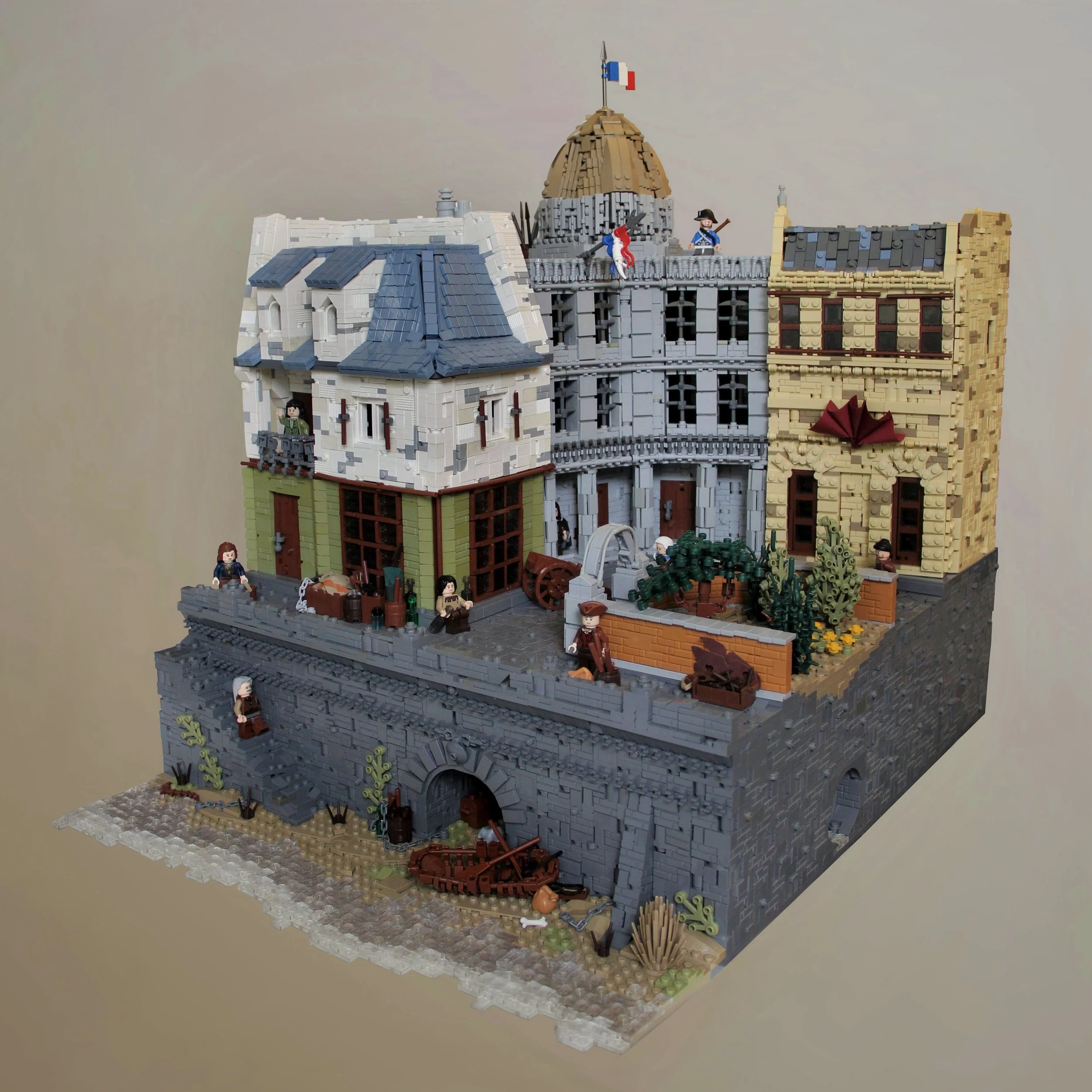
/It was the best of times, it was the worst of times: builder Timothy Shortell was on a MOCcing hiatus of over seven months keeping busy with his other life pursuits… but now he’s back to bring us this fantastic historical build of Paris in 1794 during the middle of the French Revolution.
ParIS at a dark time
His detailed realistically colored and textured build brings to life a street scene typical of the city at the time - showcasing poverty, soldiers, bumpy cobblestones, river junk and more. Yep, pause a minute to take it all in…
Wowsa!
Now let’s dive into the details and chat with Tim!
Doug: So Tim, I noticed you haven't built much in a while, what have you been up to? And what got you back in the game?
Tim: I definitely haven’t been as active lately as I used to be, mainly because I’ve been at college away from my collection and been putting most of my creative energy towards my career as a music composer. When I went back home for a couple weeks for winter break in early January though, I finally had access to my collection again and found I had a lot of free time, so I was inspired to do some building.
Doug: It’s nice to see that your time is spent on another creative outlet as I think for many of us that’s what draws us back to LEGO so frequently - the need to create! Back to the build - we all know you as a medieval/LOTR builder, so it's awesome to see you try something new. What was the inspiration to move into the enlightenment/industrial revolution genre? Frankly it's a fascinating time period.
Tim: It’s definitely a fascinating time period, and a really fun one to build as it turns out. I was inspired to try the genre because it’s something I haven’t seen a lot of done by other builders, and it’s still close enough to medieval that I could use a lot of the same techniques and styles. It’s certainly something I’d like to do more of in the future.
A most beautiful Beacon - Representative of Tim’s Typical Medieval Focus
Doug: How did you determine the layout, which is eye-catching with that elevation change down to the river and the very natural-feeling town square and park?
Tim: The layout is something that came together pretty much entirely in my head, as I wasn’t able to find any reference images with a similar layout to what I had in mind. I knew from the start that I wanted it to be viewed from an angle slightly to the right of straight on, and planned from there in order to make sure that everything would be clearly visible from that perspective.
The elevation change was also an idea I had from the very beginning. I think the added height helps bring the city to life, since it gives the viewer a taste of what’s going on beneath the streets. The lower area allowed me to incorporate a number of fun details like the boat, sewer, and stairs.
As for the layout of the buildings, I knew I wanted the dome to be the highest and farthest back point of the build, so I planned to put the government building in the far corner, leaving room for two other buildings on either side. That configuration left a lot of empty space in the area closest to the viewer. I chose to fill that space with a small park since that was short enough not to block the buildings behind it.
Doug: Excellent planning! Now you mentioned somewhere that this is probably your heaviest build yet. Did it end up taxing your collection in any key areas that caused changes to your original plans or how you would have done a technique in an ideal world?
Tim: There were a lot of moments where I was afraid I would run out of certain parts in dark gray (robot arms were a close call!), but somehow in the end I was able to scrape together just enough for everything. There were a few shortages that caused plans to change though. The roof of the tan building probably would have been entirely sand blue if I hadn’t nearly run out of sand blue tiles after finishing the roof of the left building. A lack of olive green also limited my options for the bottom part of the left building and prevented me from using olive grass stalks anywhere.
Deux tricolour!
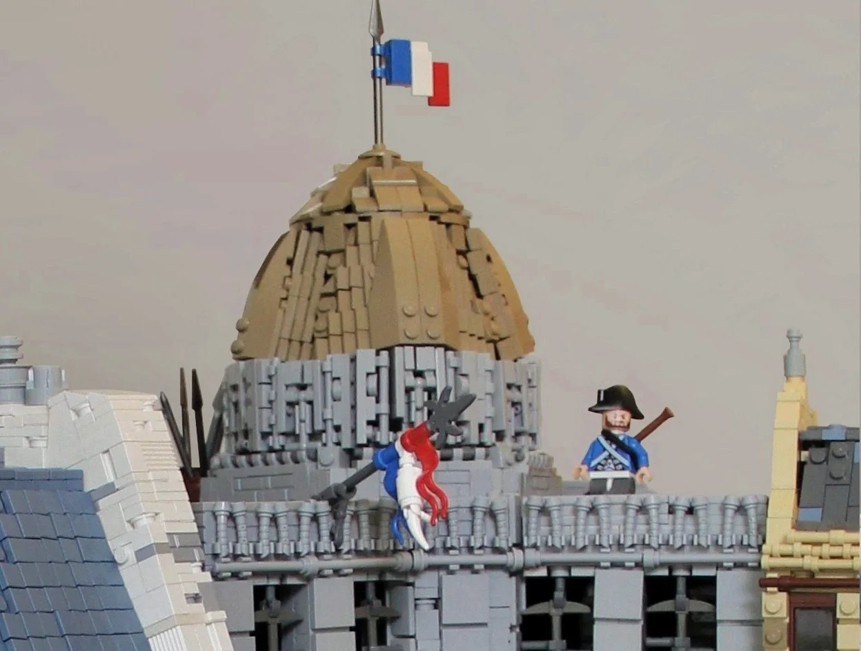
Doug: I noticed that you have two French flags flying off that central government building, and both have at least some neat brick built techniques! Was the reason for the white in the lower flag because you didn’t have a white flag or did you simply want to get in some extra texture?
Tim: I spent ages looking for flags and found one in just about every color except for white, so I’m pretty sure I don’t have one. Since I couldn’t find one, I resorted to brick building that portion of the flag. I’m actually reasonably happy with how it turned out since I think it makes it a bit more visually interesting.
Ze arch
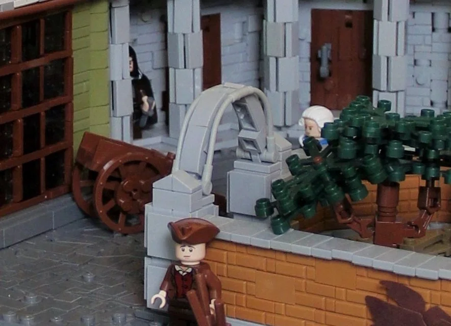
Doug: Another neat looking element of the build which got me to zoom in was the stone arch leading into the park. Can you tell us a little about creating that really nice smooth arch using the stretcher holder (30191)?
Tim: The idea for the arch began when I found the bendy light bley piece in a random bin and decided I wanted to use it somewhere in this build as an architectural detail. After I decided it would be perfect for an arch leading into the park, it was just a matter of finding other parts to fill it in with, which after some trial and error I found the curved slopes worked perfectly. It all came together pretty quickly and smoothly, which was exciting.
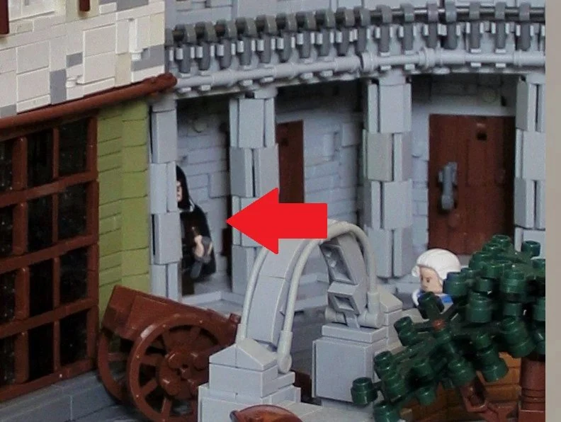
Doug: I love it when you look at a part and just know you want to use it and life… uh finds a way - i.e. it comes together smoothly as you said! Now I imagine our eagle eyed readers want me to ask about the sneaky fella behind the pillar of the government building. Does this nefarious character have a backstory?
Tim: This was a nod to one of my big inspirations for the build, which was the game Assassin’s Creed Unity. I used quite a bit of reference and concept art from the game to create details all throughout the build (e.g. brick walls of the park, clutter in the streets, minifigures), so thought it would be fitting to also include a hooded assassin.
Where’d this guy come from??
Doug: Assassin’s creed is indeed a worthy inspiration. Ok, the last two items that piqued my curiosity were the pickaxe windows in the government building and the capes you used to create a really neat round decorative element in the adjacent tan building. Seems like you had some creative moments as these buildings came together, they’re both really neat effects and work splendidly in the build. Any comment on your inspiration/eureka moments for these?
Tim: There were certainly a lot of great creative moments throughout the build process. The cape decoration was inspired by a similar technique on Wookieewarrior’s amazing Assassin’s Creed Unity build. The pickaxe windows were actually an idea I had as I was desperately looking for any remaining small dark gray parts after I had used so many in other sections of the build. I’m still not sure how I was able to find eight pickaxes, but I’m glad I was since they ended up working quite well for windows.
Pickaxes, capes, textures OH MY!
Doug: I love it when you find just the right amount of a part! With that we’ll wrap it up, thanks for taking the time to chat with me Tim, and I just want to reiterate how much I enjoyed the build!
Tim: Thanks so much, I’m glad you liked it!
I hope you all enjoyed learning a bit more about Tim’s Paris 1794 build. To me, it is a far, far better build that Tim did, than he has ever done; it is a far, far better deserved rest that he goes to… after creating such a great MOC!
If any of our readers are big fans of the industrial revolution genre give a shout out to Tim in the comments below!
Hoe have you come out of a short nonbuilding period? Let us know in the comments below!
Do you want to help BrickNerd continue publishing articles like this one? Become a top patron like Charlie Stephens, Marc & Liz Puleo, Paige Mueller, Rob Klingberg from Brickstuff, John & Joshua Hanlon from Beyond the Brick, Megan Lum, and Andy Price to show your support, get early access, exclusive swag and more.


