Of Scrolls and Scribes: A Study of Paperwork
/Universally loathed, paperwork is a tedious task most of us dread. And yet a vignette depicting just that won the 12x12 vignette category of the first Brickscalibur contest in 2021:
Aptly titled “Paperwork”, Francis Wiemelt’s piece deserves to be celebrated, dreaded subject matter or not. Rarely has a writing chamber looked this cozy and inviting, and rarely have late nights looked more appealing. We sat down with “Hubba Blöoba” (Flickr / Instagram)—Francis’ whimsical nickname—to find out how this little marvel came together and what considerations he had when creating it.
“When building “Paperwork,” I wanted to really play into the monotony of the endless stacks of forms and scrolls that needed to be attended to – while also giving it a bit of a mystical or fantasy feeling, which I felt was a necessity.”
It’s a testament to Francis’ attention to detail that the vignette feels anything but monotone: There are bookshelves bearing colourful spines with fun heirlooms sprinkled in-between, an ornate lectern sitting underneath a colourful stained window, old artefacts and stacks of paper tucked away on the second floor, and a chandelier hanging from textured rafters looms above everything.
Sometimes Less Is More
Francis clearly pulled out all the stops but shared that he had actually planned to include even more details: A black wrought iron ladder scaling the side of the bookshelf was shelved, and a magnifying glass for the bookkeeper’s old eyes also didn’t make the cut. Feeling too cramped after placing those details, he made the wise decision to go for a more balanced scene; a skill that is often overlooked in this day and age of detail-heaving castle creations.
Some of his favourite details are the small table made of book bindings and Ninjago horn elements, as well as the gray heirloom on the bookshelf that incorporates an infinity stone—a detail that came from experimenting with weird elements: “I’d seen a build a few months before Brickscalibur using the universal joint hinge as a connector of sorts, and I was curious to what it was and how I could use it.” Having access to just enough Technic sets to own a few of those strange components, he started messing around with them and found that they worked beautifully with elements with 1.5 connectors—and the infinity stone ultimately did the trick.
Whereas some MOCs undergo multiple changes of direction, Francis found this one’s design process to be fairly straightforward. The only thing that changed drastically over the course of building it was the stained-glass window. Originally made from elements in trans-orange, trans-light blue and trans-clear, he quickly found that it created the wrong atmosphere, resulting in him opting for a cooler night-time color palette found in the final model.
Inspiration
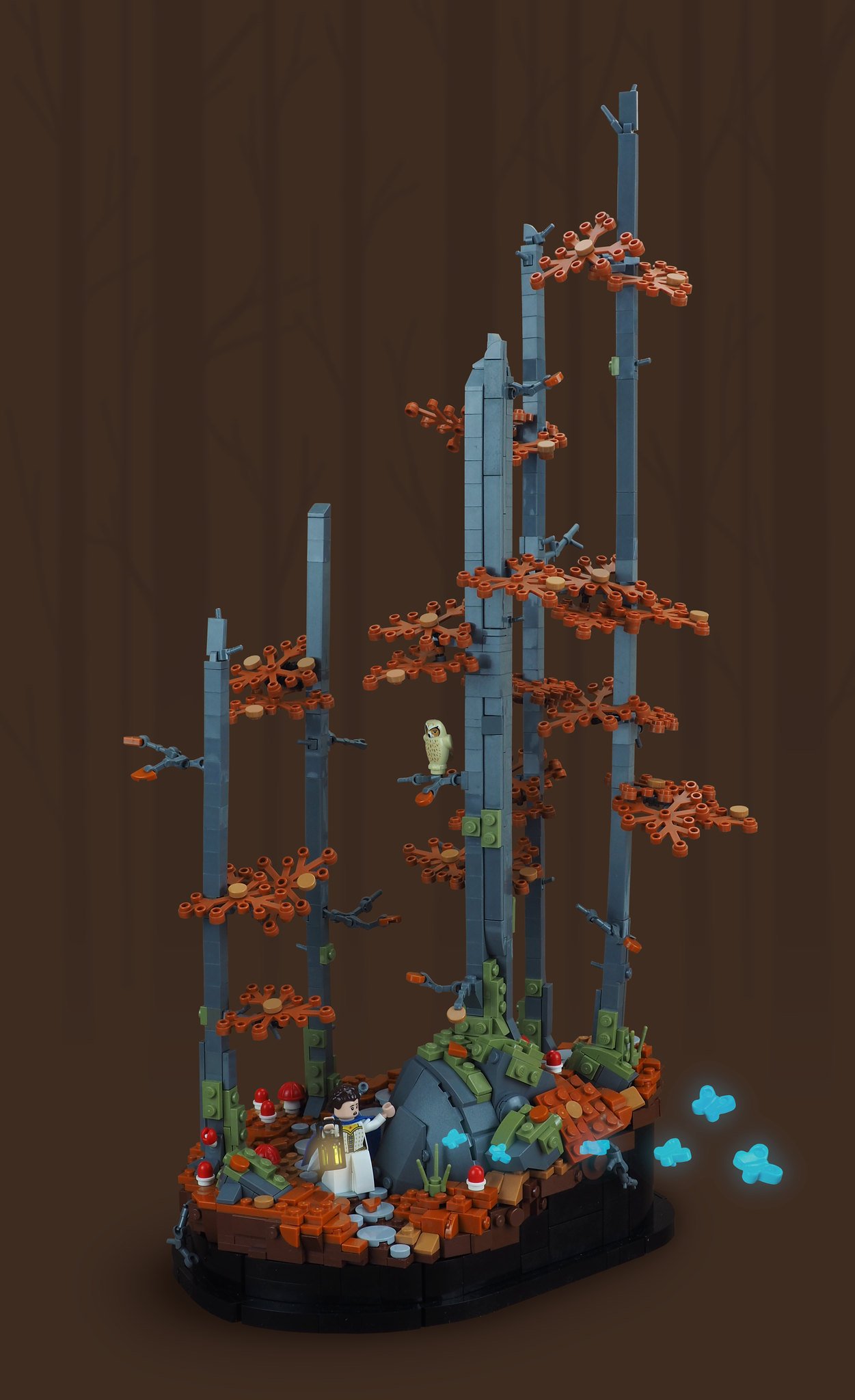
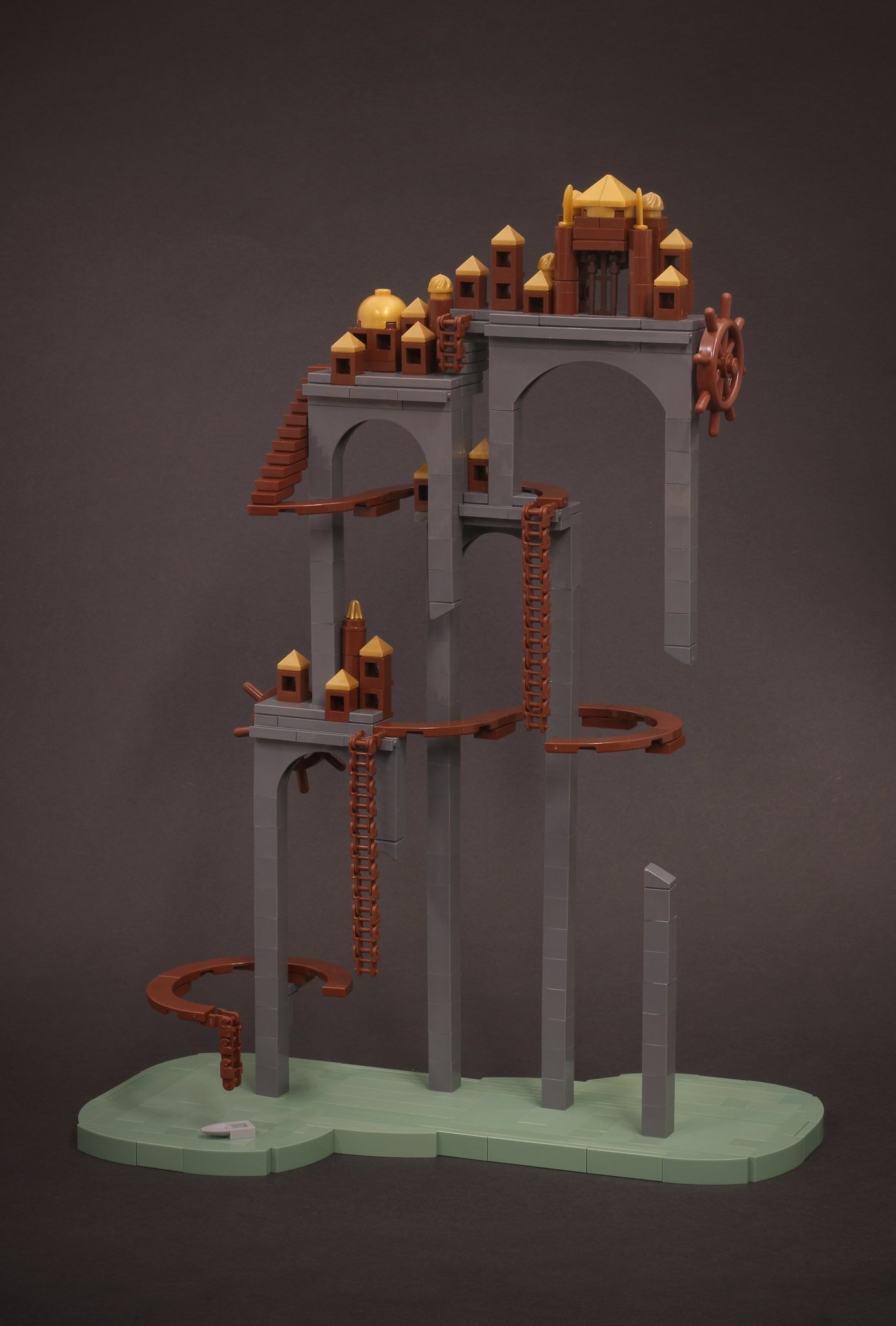
With some of his favourite vignettes being Jonah Schultz’s “And She Followed” and Eli Willsea’s “Stilt City”, one can see parallels in how Francis made use of a simple device to make the model stand out: One an eery fantasy setting that draws the viewer into a tall forest, the other a microscale study creating a whole universe with just a handful of bricks, both builds use contrasting bases. This leads to a focused setting that effectively separates this small chunk of LEGO elements from the outside world.
Evolution
What originally was a means to an end (covering up the complex SNOT work responsible for the intricate cobblestone floor) quickly became a feature when Francis realised how it would further elevate the atmosphere of the build. Rarely do you see a model completely framed by a black border, encompassing not just the base but also the walls, but by doing so “Paperwork” feels even more considered and atmospheric. The dark border becomes both a statement piece as well as a metaphor for the darkness surrounding the writer in his night-time work, framing this slice of bureaucratic life perfectly.
It also helped him to make his vignette even more unique. Having rarely seen vignettes incorporating ceilings, he set out to top off “Paperwork” and make it a full room. He ended up using masonry bricks to create some texture. Attached with simple hinge bricks angled against cheese slopes, they contrast nicely with the surrounding woodwork in reddish brown. The chandelier below makes for a nice ornament—built from a wagon wheel, Technic connectors and a few clips it just ties the room together.
Francis Wiemelt’s “Paperwork” is a masterclass in creating atmosphere and wowed not just the Brickscalibur judges. Carefully curated, it draws viewers in and elevates an otherwise boring labor to a beautiful piece of art!
What dreary but necessary labour would deserve a similarly beautiful creation? Leave your thoughts in the comments below.
Do you want to help BrickNerd continue publishing articles like this one? Become a top patron like Charlie Stephens, Marc & Liz Puleo, Paige Mueller, Rob Klingberg from Brickstuff, John & Joshua Hanlon from Beyond the Brick, Megan Lum, Andy Price, John A. and Lukas Kurth from StoneWars to show your support, get early access, exclusive swag and more.


